Developing a Notifications Framework
Problem
"Noise" during the user experience (popout clutter, intrusive modals, etc.) can distract users from their current task, degrade trust and retention, and cause "banner blindness," which hurts engagement and conversion.
Solution
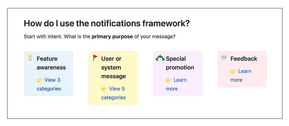
Create a set of design system guidelines to help teams contribute to a more consistent, empathetic notifications experience across the desktop product. This framework guides designers and product managers to the most appropriate component depending on the purpose of a user-facing message, ensuring that communication is more relevant, less disruptive, and drives engagement and conversion more successfully.
Process
First, we needed to define what methods and components in our design system count as a "notification," or means of grabbing a user's attention. We included:
- Alerts and banners
- Badges
- Input messages (success, error)
- Modals and carousels
- Notification center messages
- Popouts and coachmarks
- Recommendations
- Toasts
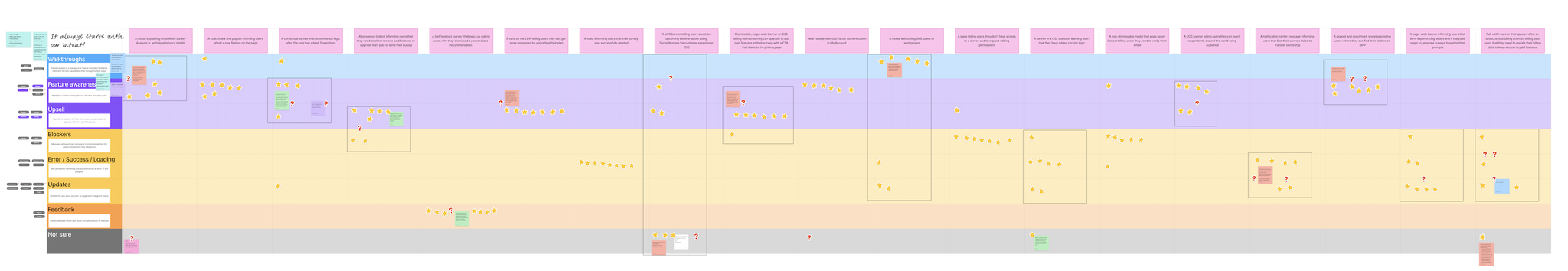
Next, my design partner and I researched best practices around using notifications and led a workshop with other designers. We showed them a decision tree -- where categories based on message purpose (functional, promotional, etc.) led to specific component solutions -- and asked them to follow the chart using examples of notifications they've created. The designers left stickies explaining how difficult or easy it was to decide between the categories we provided.
Finally, we gave them a worst case scenario: a screenshot of a page littered with notifications that could potentially trigger at the same time. We asked the designers to rate the importance of the notifications from 1 to 5 from both a user and business perspective and share their rationale.
We took their feedback and iterated on the purpose categories, this time adding subcategories for more nuance. Then we pressure-tested the changes in a second workshop by asking designers to categorize specific scenarios using the new decision tree. Afterward, my design partner and I did an affinity mapping to find common themes and divergence across feedback.
Results
By identifying common problem areas, we were able to solve for the remaining points of overlap and confusion. We then presented our learnings and proposal to the notifications team at an on-site.
After getting alignment, we created a "living" document that we shared with Product, Engineering, and Design teams so they could pressure-test the framework in their experiments, identify edge cases, and share feedback to help us refine.
Post a comment