Sign-up Paths on Mobile

Problem
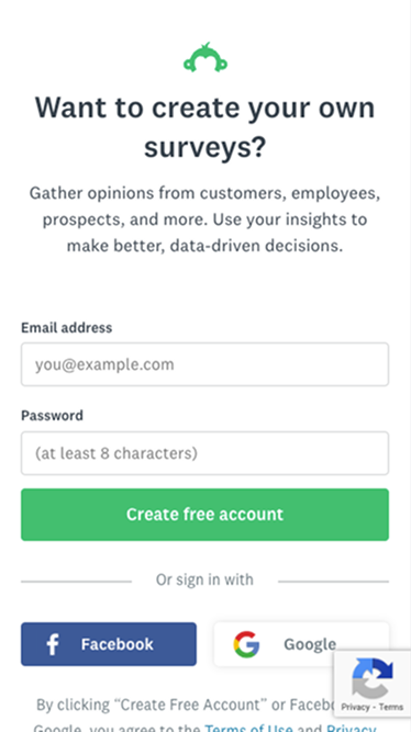
In user research, 50% of users who signed up through our survey endpage said they wanted to take more surveys. But all of them were shown a "create survey" path. A third of these users thought signing up was required to complete the survey they were taking. This led to many accounts remaining inactive, which hurts engagement metrics.
Solution
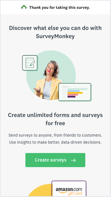
Since most endpage sign-ups come from mobile, we designed a new mobile endpage that gave users the choice of creating a survey or taking more surveys.
Process
Together with the designer and product manager (PM), we made sure that the second option was at least partially visible below the first, which required keeping copy concise. New brand imagery, as well as using components from the updated design system, helped the presentation feel more fresh.
We also needed to clarify that users were done taking their current survey. To communicate this, we incorporated a
top banner and re-emphasized the message with copy that implied users could take further actions.
To distinguish the CTAs, we changed "Create free account" (which led to confusion) to "Create surveys" and made the other CTA "Take more surveys."

Results
The new endpage significantly increased the number of people who continued to take more surveys, increased engagement for those who chose to create surveys, and improved conversion and bookings.
We planned to iterate to keep both CTAs above the fold to see if that further improved metrics.
Post a comment