Pricing Page Refresh
Problem
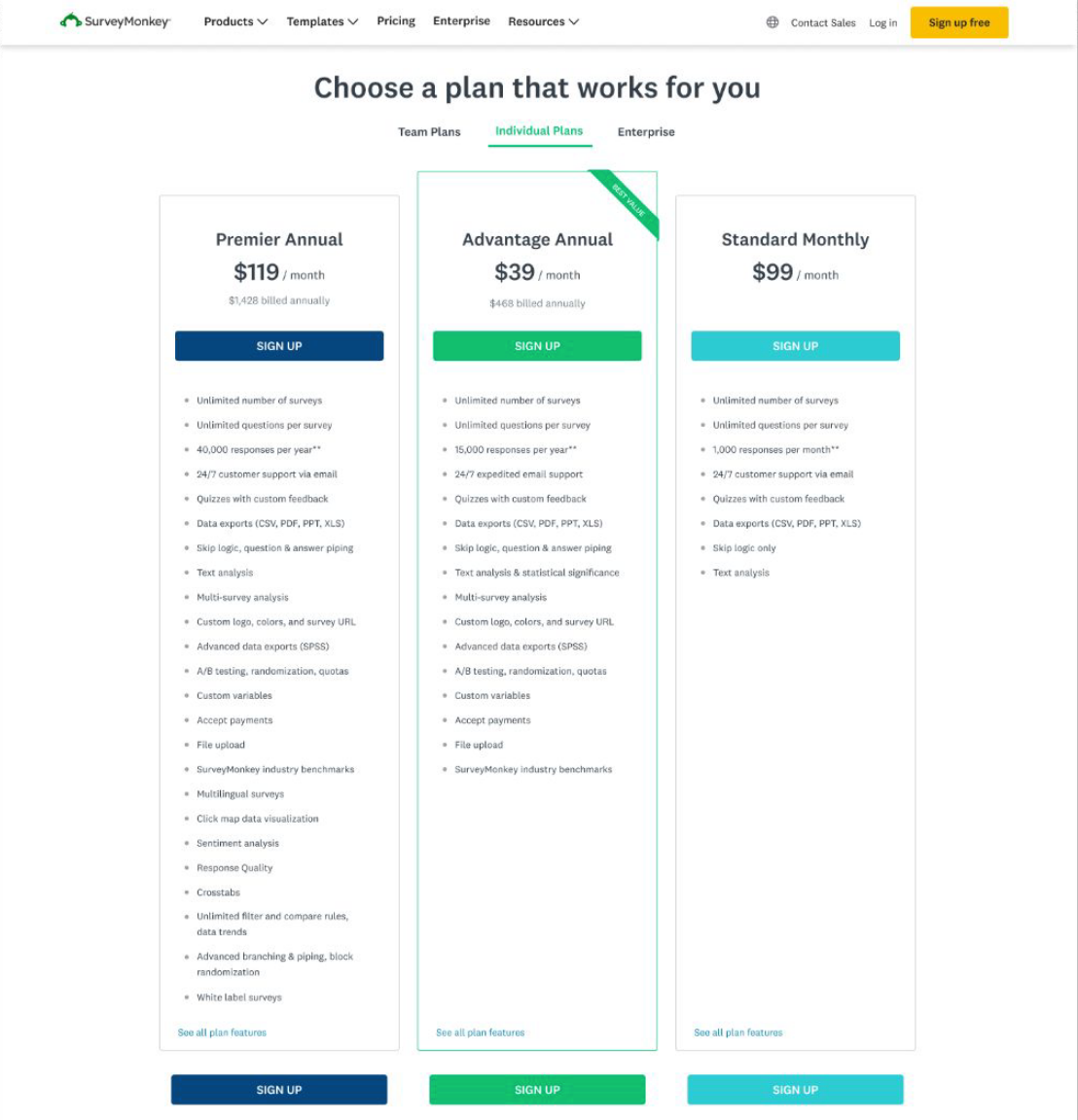
SurveyMonkey’s pricing page lacked a clear presentation of plans and features. This inhibited value discovery and limited conversions.

Experiment
We decided on an A/B/C test with two new approaches at simplifying content and increasing comprehension:
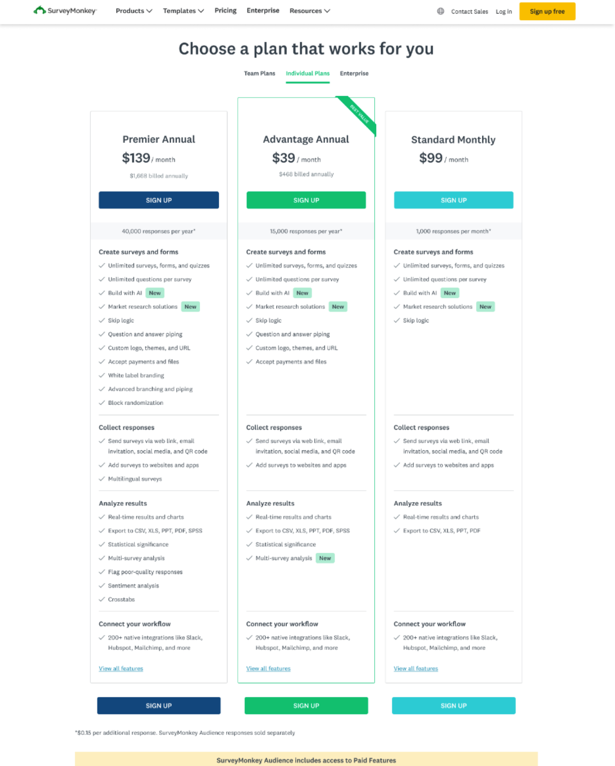
Treatment 1: Add categorization to the current plan summaries
Treatment 2: Distill the plan summaries so they show fewer features
Both treatments would include the same optimized content changes to the Details pages.
To keep scope tight and accelerate engineering timelines, we decided to make minimal design changes, which meant working within legacy designs. A full UX refresh would come later, informed by the results of this experiment.
Process
Information architecture audit
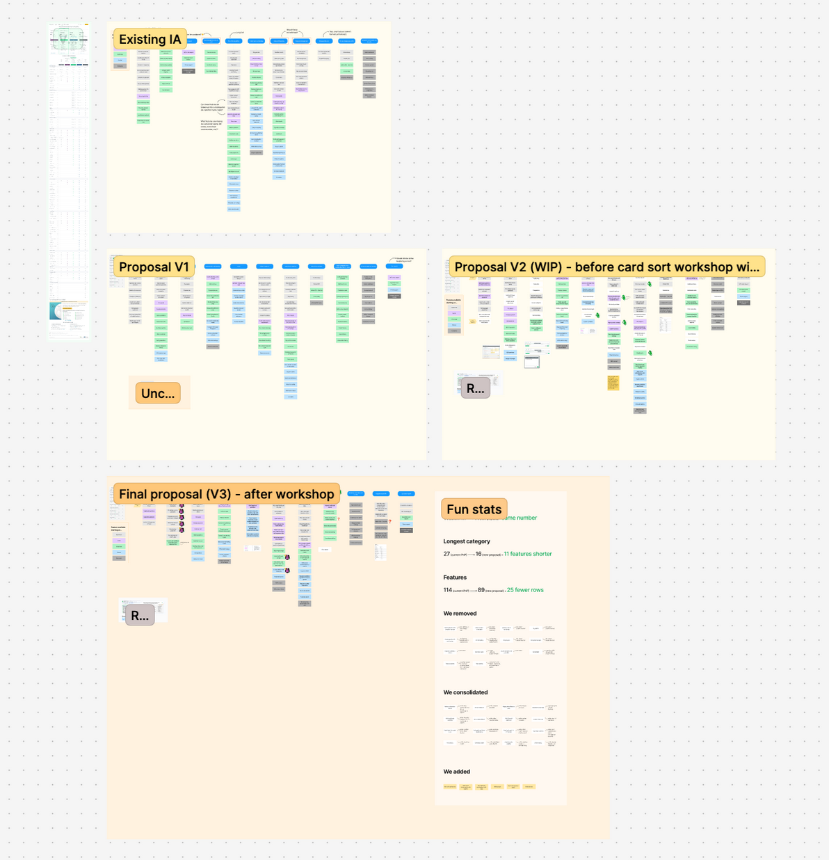
The Details pages, which listed all the product features available on individual (1 user) vs. team plans (3+ users), offered a significant information architecture opportunity. I noticed the existing categories could be more logically sequenced to match user expectations, and the features better organized to fall more intuitively within those categories.
While I collaborated with the Product Manager (PM) to select features that would be most competitively advantageous to show on the Summary pages in Treatment 2, I conducted a content audit on the Details pages. Using card sorting in Figma, I listed out all the features and grouped them into their existing categories. Then I created a set of new categories and reorganized the features more logically, with new copy for clarity. This process involved researching the more vaguely named or complex features to better understand and sort them. My product design and marketing partners, as well as the PM, gave feedback on my recommendations.

Changes
The new proposal contained clearer category names sequenced in a way that followed the natural user flow within the product: first survey creation, then distribution, then analysis, and so on. Some features that were considered tablestakes were removed, and others were combined onto one line item if they were highly interrelated. I added newer features that were also missing from the Details page, which was important for plan comparison when a user was considering upgrading after viewing a feature paywall in-product. And given that the features needed to be listed in a way that created a cascading "waterfall" effect across plan columns – with each dot in a column signifying that the feature was included on that plan – I grouped related line items (like styling features) together when possible.
My PM and I carried the category names over to Treatment 1's Summary pages for consistency in language, making minor modifications as needed. That way, if users liked a feature shown under a category on the Summary pages, they could more easily find it by looking for the same category on the Details pages.
Additionally, I set up workshops with members of the Sales, Customer Success, Product Research, and SEO teams. Showing them the before and after changes to the line items that were removed or combined, I asked for their feedback based on their domain knowledge and experience from any customer-facing conversations they have. This influenced the final proposal, strengthened my rationale when presenting to leadership, and ensured that the new length of the Details page was more palatable. It felt "just right" in terms of making our packaging appear competitive while also reducing cognitive load with a more simplified information architecture.

Post a comment